Builk 3.0
UX
December 2012
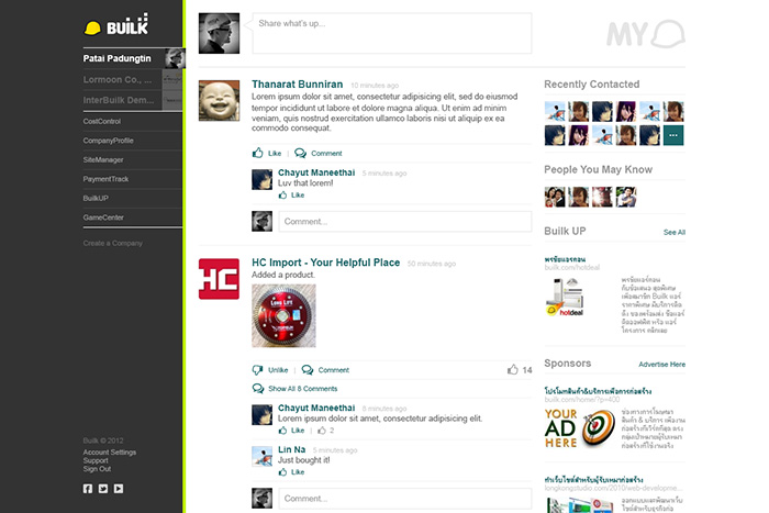
When Builk wanted a redesign for the next version of their construction management application, we initially looked into some clearer design directions which brought the navigation to the forefront.
However, upon further discussion, we decided to try a cleaner, bolder, and more minimalistic approach.
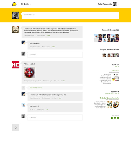
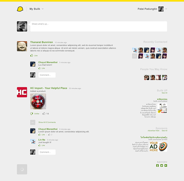
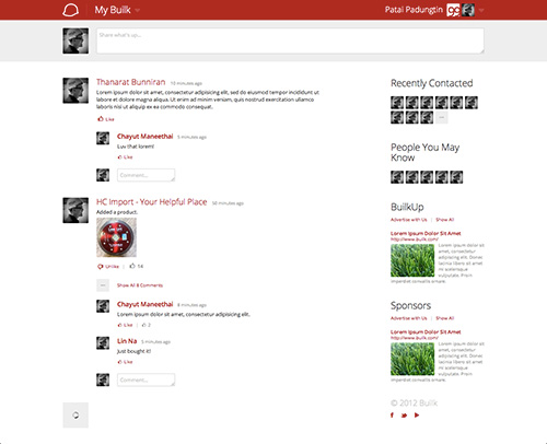
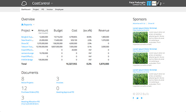
“Builk boasts a clean and bold interface. Striped to the core, all design elements must serve a well justified purpose. Headings are bold, not in font weight, but in size and color – sporting a prominent fixed page header and oversized titles which ironically are light weight promoting a crisper and more sophisticated design. Objects have subtle rounded corners, a personal touch of softness and added character. Form objects are created using very clean and simple lines. Icons are to the point and convey the message without unnecessary color. Less important elements are lighter, drawing focus to what matters most. And above all, generous use of white space pulls together a minimalistic, efficient, and performing design.”
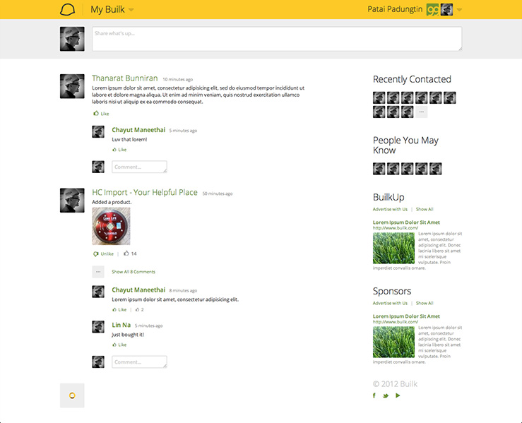
The mega drop down menu was used to reduce clutter by hiding the main navigation while remaining prominent and always accessible.
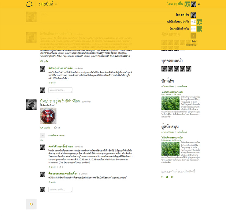
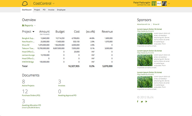
The simple design and color palette added value with custom branding.
Further details on the design can be found on the Builk Style Guide.